Project details
- Team
- Customer Reviews
- Year
- 2025
- Timeline
- 3 months
- Experience
- Amazon Shopping
- Platforms
- iOS, Android, Web
- Devices
- Mobile, Desktop, Tablet
Some details are generalized. Read confidentiality note.
This case study shares my contribution, design process, and decision rationale, supported by publicly available information and clearly labeled reconstructions. Confidential research, internal metrics, experiment details, nonpublic results, proprietary information, and unreleased interfaces are excluded. I can provide a redacted PDF version upon request to support hiring reviews.
I turned fragmented ratings into a framework teams could use.
A rating should help you compare products without making you work out a new pattern on every page. Across Amazon, the same familiar signal was presented in different ways.
I led the redesign from the audit through the framework's first adoption. I defined the rules, built the Figma components, and worked with design-system and engineering partners to carry the design into implementation.
Public screenshots and labelled reconstructions illustrate the work. Internal research materials, experiment configurations, and results remain private.
Six examples from the audit
Order

PDP · value first

Legacy search · stars first
Count notation

Search grid · full count

Similar products · lowercase k
Alignment

PDP recommendation · inline
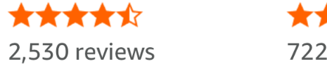
Books carousel · stacked
Shared framework
Standard
Condensed
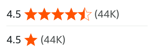
Rating value → stars → ratings count
I mapped 21 rating examples across the shopping journey.
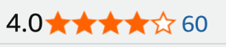
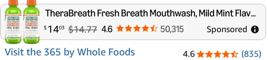
I collected rating examples across shopping surfaces and looked at what changed: which elements appeared, their order, and how the count was formatted or linked. I then grouped the 21 examples by customer task to understand what each variation was doing in context.
All 21 rating examples
The same 21 examples can be viewed together or grouped by what the customer is trying to do.
Showing all 21 audit examples in one grid.














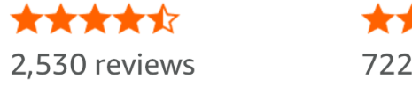


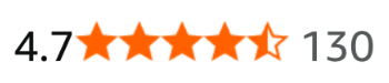

- Hierarchy: Which elements stayed, which disappeared, and what came first?
- Supporting detail: How did the count's precision, notation, and placement change?
- Behavior: Where did the presentation suggest a path to more information?
I wanted to understand which differences served the customer and which needed a shared rule.
The inconsistency followed customers through shopping.
These examples span different products and capture dates. They are grouped by customer task, and discovery can recur in recommendations or the cart. An individual review serves a different purpose from an aggregate rating, so its missing count is not an inconsistency.
I used prior research to decide what the framework needed to preserve.
The audit showed what varied. I reviewed earlier customer research to understand what each part of the rating contributed, then used that understanding to define the hierarchy. The score, stars, and count each had a job to do.

- Rating value
- Gives the score.
- Stars
- Make the signal familiar at a glance.
- Ratings count
- Shows how much customer feedback supports that score.
I kept the relationship consistent: value, stars, then count. The next question was how much detail customers needed at each shopping moment and how they could reach more.
Keep the signal familiar. Reveal more as the question deepens.
Show enough to help customers take the next step, then make more detail available when they choose to explore.
Search
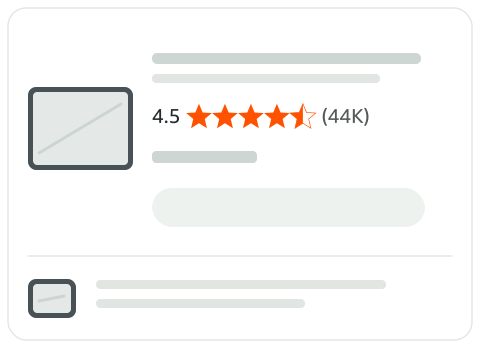
A compact count for scanning products: (44K).
Open the product
Top of PDP
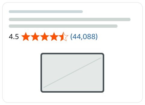
The exact count and a link to customer reviews: (44,088).
Open the ratings link
Customer reviews
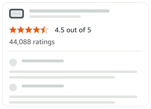
The same score, with the reviews behind it.
I focused the study on count detail and the path to reviews.
I designed a multivariate study in Search and at the top of the product page to explore how much ratings-count detail to show and how customers could reach more. I considered count formatting and interaction together because both could affect how the information was understood and used.
I've kept the treatment matrix and results private. The table summarizes the wider design questions I worked through across the project.
| Decision area | Question I worked through |
|---|---|
| Information presence | What does each element contribute, and what would customers lose if it disappeared? |
| Hierarchy | How should the value, stars, and count relate to one another? |
| Progressive disclosure | How much count detail helps at this point in the shopping journey? |
| Notation | How should an abbreviated count remain clear and recognizable? |
| Interactivity | How should the count signal a path to more information? |
| Visual presentation | How can size, color, alignment, and spacing work across different placements? |
These questions span the project. The MVT focused on count disclosure, notation, and interactivity; research, component design, accessibility, and implementation constraints also informed the framework.
Framework treatment
Search
Keep the count compact while showing the scale of the customer feedback.
Abbreviated count · capital K · parentheses.
Framework treatment
Top of PDP

Show the exact count and give customers a direct path to the reviews.
Full count · linked to reviews · parentheses.
These were the decisions that shaped the framework.
I separated journey rules from width rules.
What does the customer need here? This guides the amount of supporting detail and the path to reviews.
Does Standard fit with the required padding? This determines whether the placement can be considered for Condensed.
Journey stage and available width answer different questions.
Standard
The default: rating value, five stars, and count.
Condensed

For approved constrained placements: value, one star, and count.
Standard + Link
At the top of PDP, the full count links to customer reviews.
Expanded

In Customer Reviews, the score is shown with fuller supporting context.
Follow one product through the framework.
Illustrative demo
Stage 1 of 4 · Discover
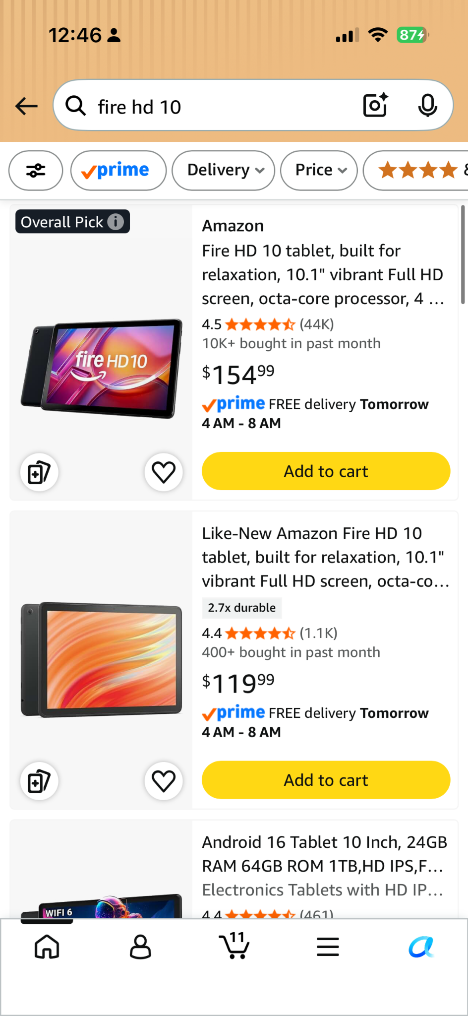
Search
STANDARDThe abbreviated count gives customers a compact overview while they scan products.
Here's how those decisions work together on actual shopping surfaces.
Make the rules clear enough for another team to use.
I wrote the usage guidance, do's and don'ts, and technical and accessibility specs so teams could adopt the framework consistently. The guidance covered what they could change, what needed to stay consistent, and who to contact when a placement needed review.
When Condensed becomes eligible
Standard fits
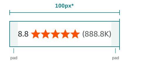
The complete Standard fixture fits within the illustrative allocation, including padding.
Standard overflows
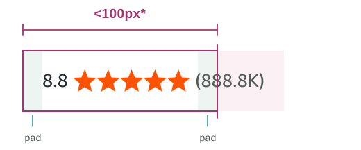
The same fixture no longer fits when less width is available.
Condensed fits
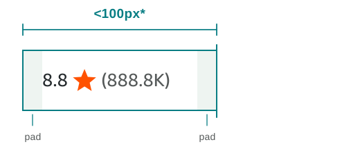
The single-star treatment fits this example while keeping the value and count.
Standard was the default. If the complete lockup could not fit within the allocated width, including padding, the team could request Condensed. I kept eligibility separate from approval so the actual placement still received review.
The 100px example includes padding and illustrates the rule. The production threshold is omitted, and the figure is enlarged for readability.
I used 8.8 ★★★★★ (888.8K) as an artificial sizing fixture to stress-test a wide combination of characters. It is not a real rating.
Condensed has a defined reason to exist.
Define behavior beyond the pixels
Reading order
Communicate the score once, followed by the count and the purpose of its link.
4.5 out of 5 → 44,088 ratings, link

Keyboard focus
Tab reaches the ratings-count link. The static value and stars are not separate tab stops.

Destination
The link opens customer reviews for the same product.
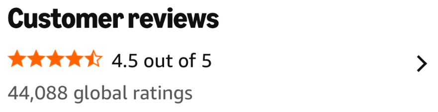
I documented reading order and keyboard focus separately. The stars belong to the score's description; they should not create repeated announcements or extra tab stops.
The framework works beyond its visual appearance.
Guardrails crafted for consistent adoption.
Preserve the hierarchy
Do
Don't

Keep value → stars → count. Changing the order changes how the signal is read.
Abbreviate without overstating
Do

Don't

Round down: 10,392 becomes (10.3K), never (10.4K). Keep the capital K and parentheses.
Keep text weight consistent
Do
Don't

Use the component's defined text weight. Do not make the count bold on its own.
Match styling to behavior
Do
Don't

Keep static counts free of link styling. An underline suggests an action the static count does not provide.
This pair shows a static count. The linked count at the top of PDP has its own interaction styling.
The important conventions are explicit.
Make the component usable by other teams
- Use the product's rating data. Keep the displayed score, stars, and count consistent.
- Choose the documented treatment. Account for customer context and available width.
- Preserve the shared conventions. Keep the specified order, notation, weight, and interaction cues.
I worked with engineering to understand how truncation would behave, then used that to shape the Figma components and handoff. I also documented how teams could raise questions and request an exception.
The component, specs, and guidance gave us a shared reference for reviewing whether the implementation matched the design intent.
I guided Devices through the framework's first adoption.
Devices was the first team to adopt the framework. I reviewed its Condensed design in the app-card experience, worked through iterations with the team, and approved the design for use. That review connected the shared rules to a real placement.
Before · Appstore cards

- Star appeared first
- Rating value appeared second
- Rating count was omitted
Original interface capture, cropped to one row.
After · Condensed adaptation

- Rating value comes first
- Familiar star cue remains
- Supporting count is included
- Compact treatment fits the card
Portfolio reconstruction of the Condensed treatment, using the same game row.
Both sides show the same games. The enlarged example follows Toca Boca World, with 4.1 and (51K) shown in the adaptation.
This comparison illustrates the adaptation. The reconstructed image is not an A/B-test result or a release capture.
The same design questions show up across the site.
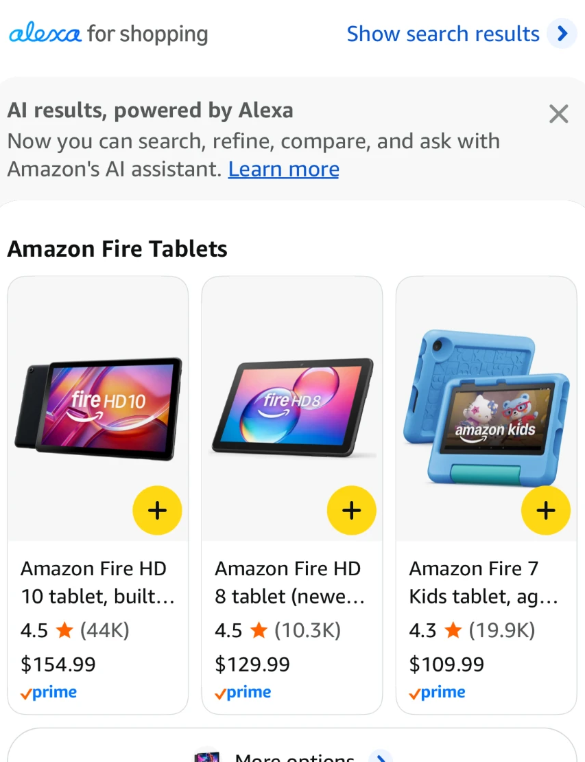
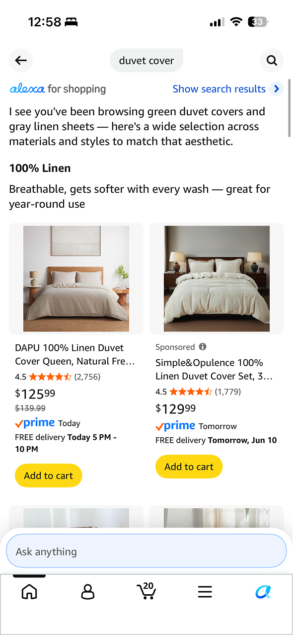
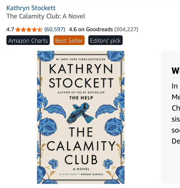
These public examples show the range of contexts the framework needs to account for. They do not establish adoption by every team shown.
The framework became a shared design-system standard.
With the framework in the design system, teams had a shared reference for hierarchy, count formatting, contextual treatments, and exception reviews.
I carried those decisions into Figma components, accessibility specs, and implementation guidance, then worked with Devices through the first adoption. The framework could now be applied beyond the team that created it.
- Scope
- 21 examples organized across three customer tasks.
- System
- A shared design-system standard with reusable components and guidance.
- Application
- First adoption by Devices, with design review and iteration.
Governance was part of the design.
I learned that consistency depends on making the reason for each variation clear. A full product page and a compact app card have different needs. My job was to preserve the information customers relied on while giving teams a clear way to adapt it.
If I repeated the work, I'd bring the content rules, width conditions, and accessibility expectations into one review checklist earlier. I'd use it with design and engineering, then revisit real placements after adoption to see where the guidance still needed work.
A scalable system does not eliminate variation. It makes every variation explainable.