Project details
- Team
- Customer Reviews
- Year
- 2025
- Timeline
- 2-week design engagement
- Experience
- Amazon Shopping
- Platforms
- iOS, Android, Web
- Devices
- Mobile, Desktop, Tablet
Some details are generalized. Read confidentiality note.
This case study shares my contribution, design process, and decision rationale, supported by publicly available information and clearly labeled reconstructions. Confidential research, internal metrics, experiment details, nonpublic results, proprietary information, and unreleased interfaces are excluded. I can provide a redacted PDF version upon request to support hiring reviews.
Turning thousands of reviews into a decision customers can make with confidence.
Customers couldn't tell mixed sentiment from negative, didn't know the tags were tappable, and had no visible evidence behind the AI summary. I redesigned the experience and the decision process behind it, giving Amazon a repeatable way to evaluate AI comprehension.
- Three-state sentiment systemPositive, mixed, and negative each have a distinct icon.
- Mention counts on every tagNumbers show how many customers mentioned each topic.
- Clear affordance to exploreBlue links and a 'Select to learn more' cue signal the tags are tappable.
- Evidence one tap awayA bottom sheet reveals sentiment split and source quotes.
- Three-state sentiment systemPositive, mixed, and negative each have a distinct icon.
- Mention counts on every tagNumbers show how many customers mentioned each topic.
- Clear affordance to exploreBlue links and a 'Select to learn more' cue signal the tags are tappable.
- Evidence one tap awayA bottom sheet reveals sentiment split and source quotes.
AI was generating insights customers didn't understand
AI review summaries compressed thousands of opinions into a glanceable summary. The layer underneath, sentiment, interactivity, and evidence, was failing quietly.
Customers struggled to:
- Interpret sentiment states
- Recognize interactive review filters
- Understand how the AI arrived at its conclusions
Without those three things, customers couldn't trust the summary or use it to go deeper.
Make AI-generated review insights understandable, trustworthy, and actionable.
Three signals were breaking customer trust
Legacy CX (Control) · Customer Reviews section of the Product Detail Page (PDP)
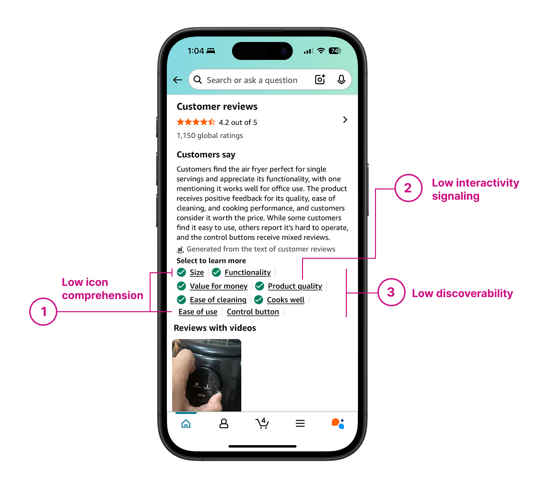
| # | Signal | Problem | Customer impact |
|---|---|---|---|
| 1 | Low icon comprehension | Only positive sentiment had a clear icon. Mixed and negative were read as missing information or the same state. | Lower trust in AI |
| 2 | Low interactivity | Aspect tags looked like metadata instead of tappable controls. | Missed review exploration |
| 3 | Low discoverability | Customers rarely used the tags to explore deeper review content, leaving the summary's richest value untouched. | Less engagement |
Designing inside multiple constraints
 Two-week design engagement
 4-treatment default
 Semantic conflict with existing success-alert pattern
Before designing anything, I validated the existing system

Baseline user study
I ran a scenario-based usability test on UserTesting.com. Participants evaluated an air fryer purchase while I measured icon comprehension and collected qualitative feedback on sentiment, interactivity, and discoverability.
Competitive audit
I audited 20+ e-commerce platforms to see how they handled sentiment and review exploration.
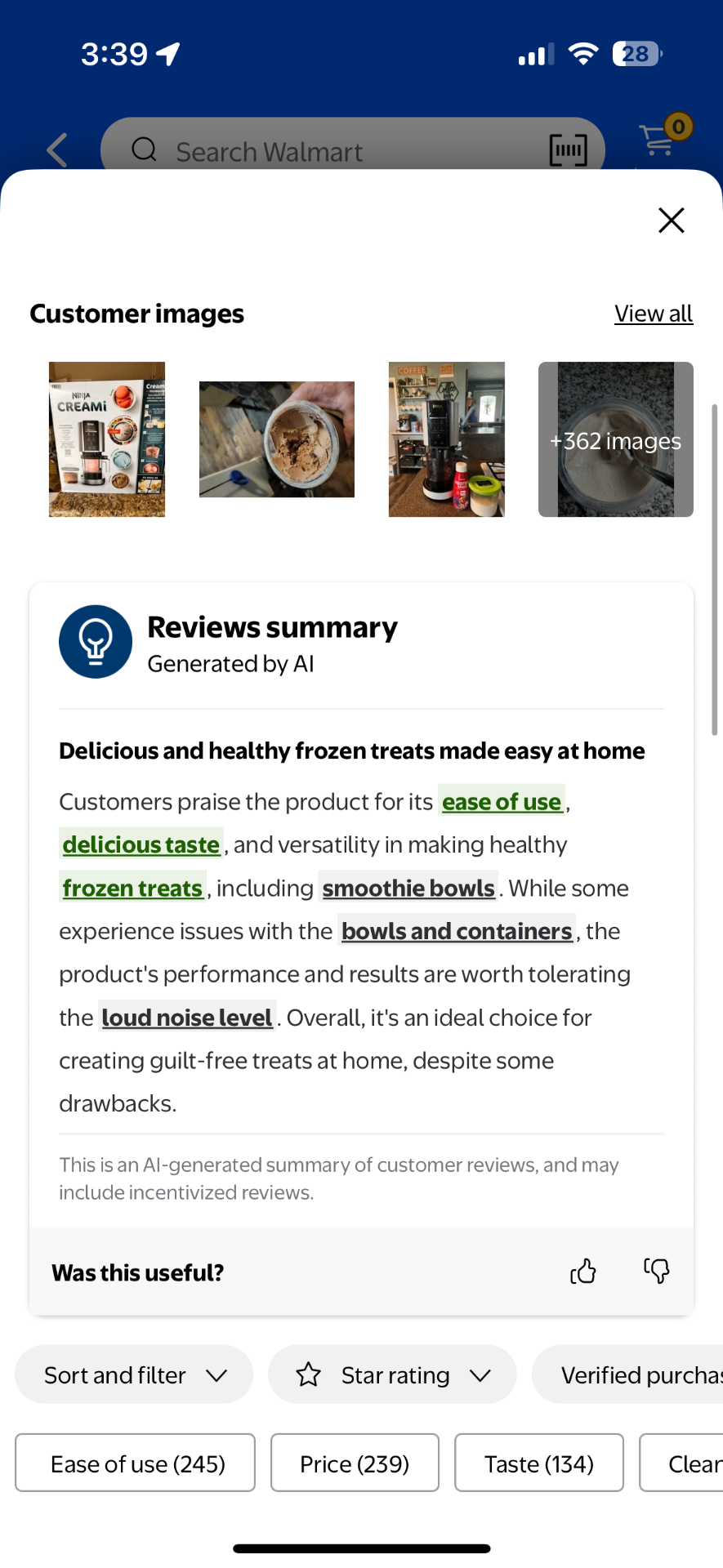
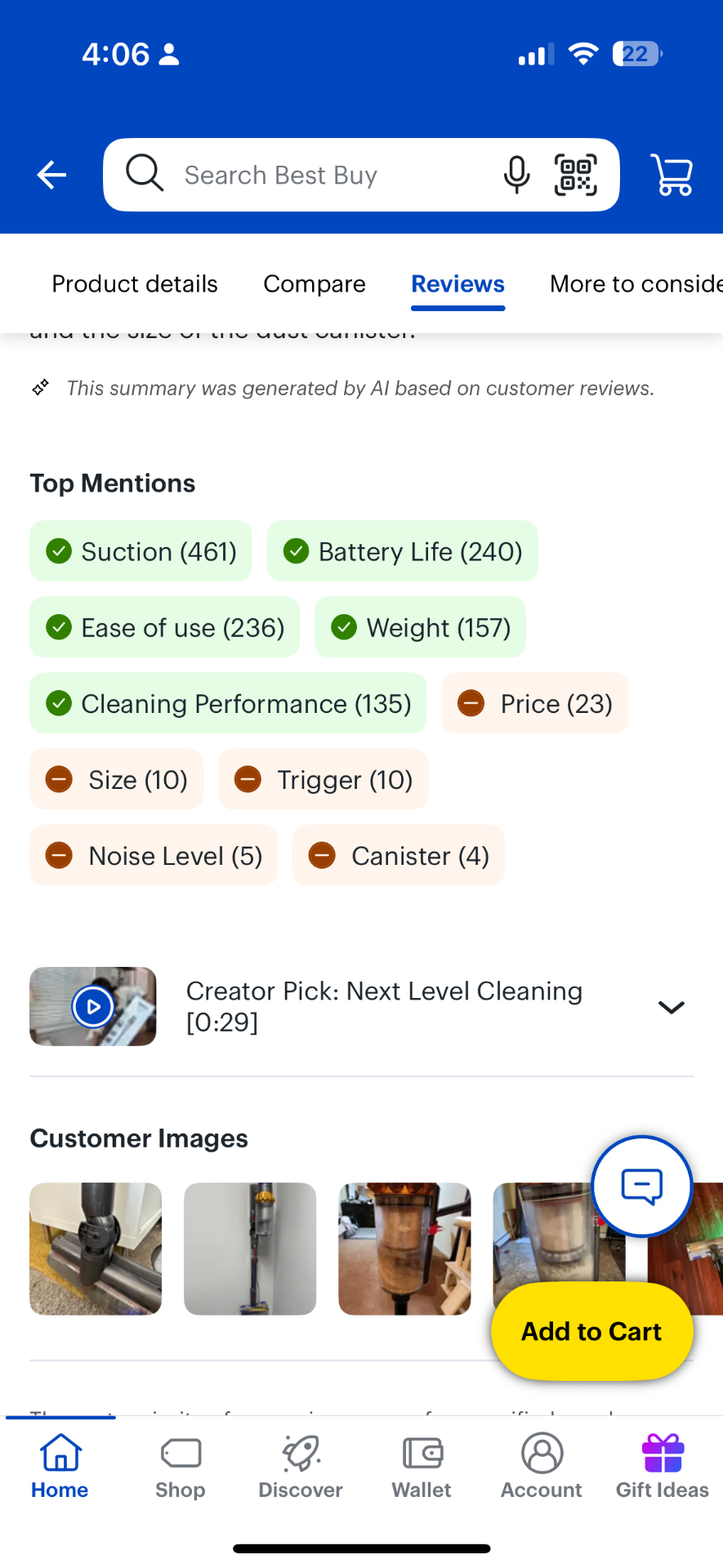
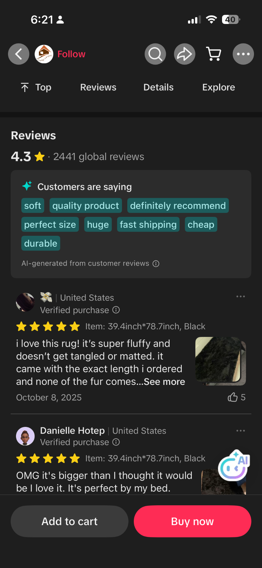
Across the 20+ platforms I reviewed, I found no consistent standard for communicating positive, mixed, and negative sentiment as one system.
Most platforms relied on text labels, stars, or ratings rather than abstract icons alone.
Common metaphors like thumbs, emojis, and plus/minus carried multiple meanings across contexts.
Three decisions that shaped the sprint
Resolved a semantic conflict before scaling the system.
Leadership’s initial ask was simple: add mixed and negative sentiment icons alongside the existing positive checkmark. I pushed back because the problem wasn’t just that two icons were missing.
The checkmark itself already belonged to Rio’s success-alert pattern, where customers understood it as confirmation, not positive sentiment. Adding two more icons without first testing whether the full system made sense would have scaled the inconsistency instead of fixing it. I proposed validating all three sentiment states together before committing to any one icon.
- Shifted the project from designing one icon to designing a cohesive sentiment system grounded in research.
- Brought systems-level constraints into the evaluation process and prevented design decisions from being made on usability data alone.
Reduced the solution space through research and systems thinking.
I evaluated candidates across customer comprehension, cultural scalability, and design system fit. The question became "Which complete sentiment system is easiest to understand?" not "Which icon looks best?"
Established a research-backed process for evaluating complete sentiment systems rather than isolated symbols.
Structured experiments to maximize learning.
The team initially wanted to test iconography and interactivity together. I separated them into sequential experiments so each result could be tied to one variable. The standard four-treatment limit could not accommodate the complete icon-system comparison; I needed thirteen treatments: a control plus twelve icon systems. I built a one-page recommendation and secured buy-in from leadership, product, and engineering to expand the study.
Testing multiple changes at once would have identified a winning treatment without explaining why it worked. I separated the variables so the team could make confident decisions from each result and avoid repeating research to fill gaps later.
Which sentiment icons are understood across positive, mixed, and negative signals?
How should customers interact with tags to learn more without losing context?
Does surfacing mention counts and evidence increase confidence in AI-generated claims?
- Established a repeatable experimentation framework by isolating variables across three sequential studies, so each result could be traced to a single change.
- Expanded the icon study from four to thirteen treatments (a control plus twelve icon systems) without sacrificing methodological rigor.
Three experiments, each building on the last
Icon comprehension
Tested which icon system customers understood best. All treatments used the same legacy interactivity so only the icon variable changed.
| Control | T1 | T2 | T3 | T4 | T5 | T6 | T7 | T8 | T9 | weblabT10 | T11 | T12 | |
|---|---|---|---|---|---|---|---|---|---|---|---|---|---|
| Positive |  | | |  | |  | |  | |  | |  | |
| Mixed | - |  |  |  |  | | | | | | | | |
| Negative |  |  | | | |  | |  | |  | winner |  | |
Diagonal arrows with the squiggly mixed icon won (T10), outperforming the checkmark and supporting the decision to test the full visual language rather than extend the existing pattern.
Interactivity
Using the winning icon set from Experiment 1 as the control, tested whether tags performed better as links or buttons.
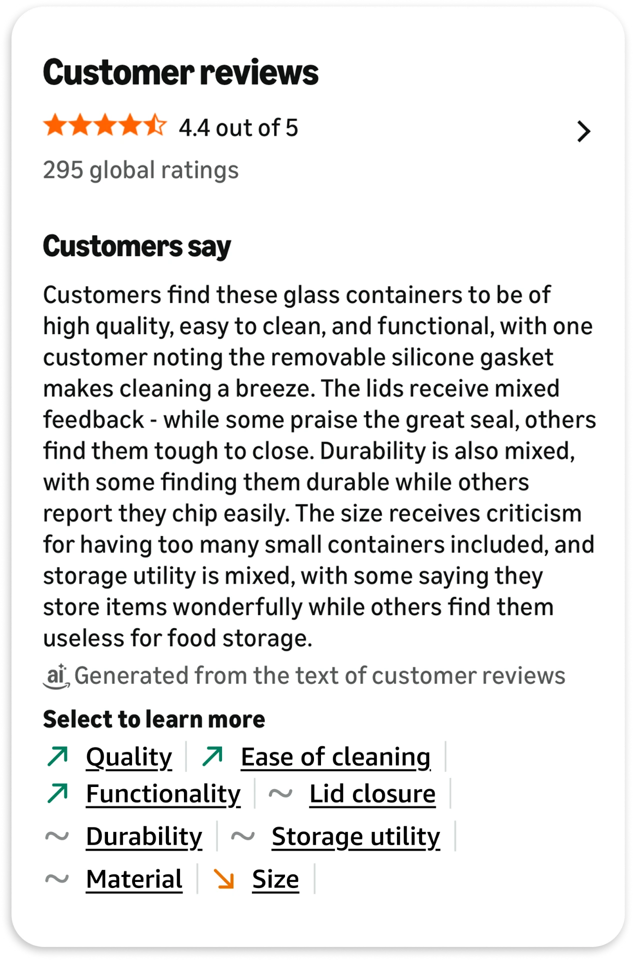
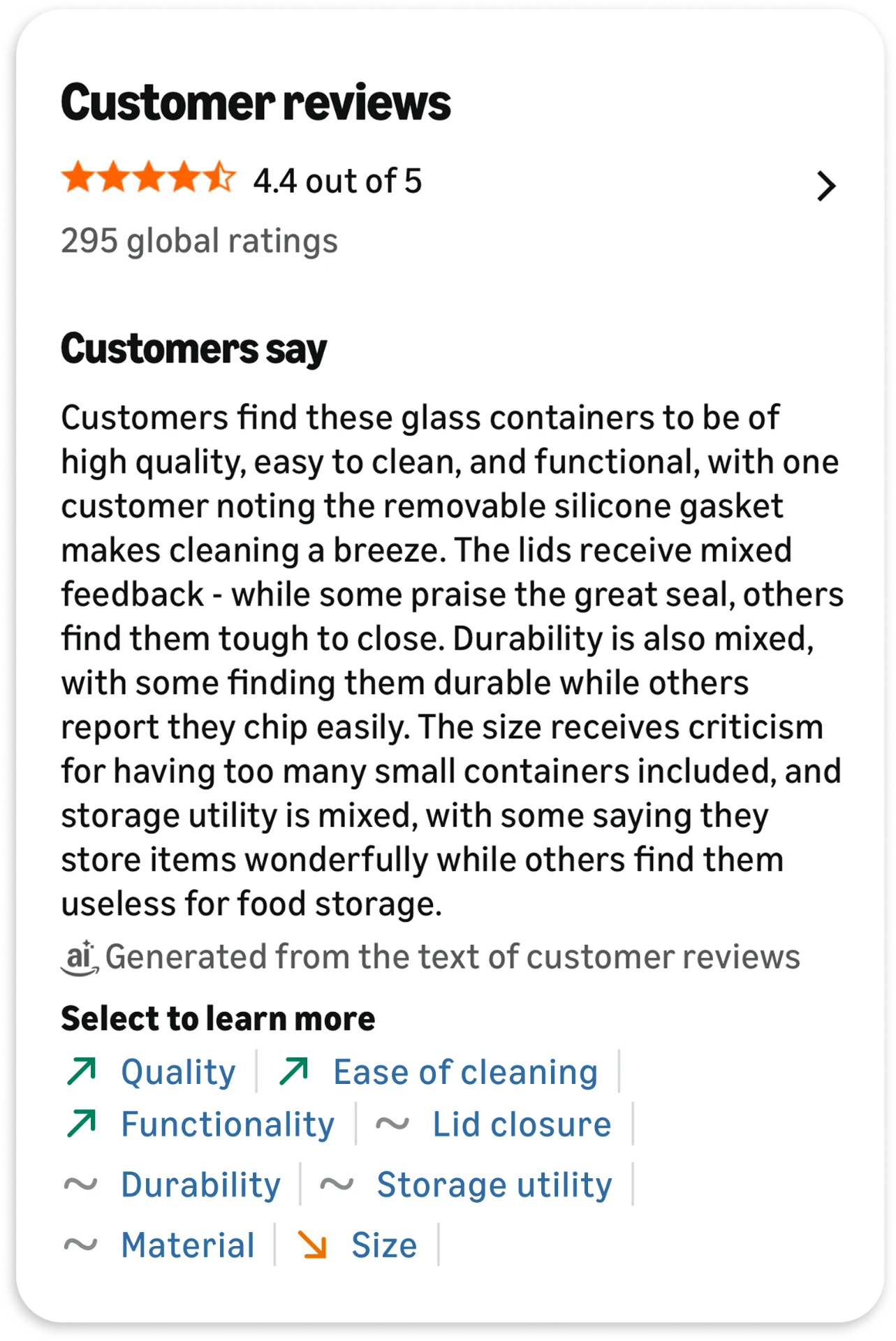
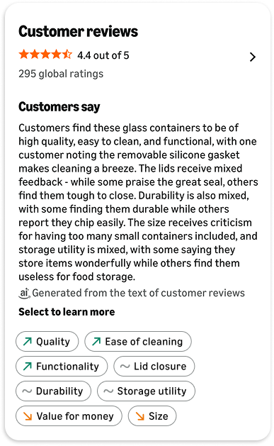
Link-style tags won on engagement, making a planned color-based discoverability follow-up unnecessary.
Trust
Using the winning interactivity treatment as the control, tested whether adding a visible mention count increased trust by surfacing real review volume.
Mention counts won. Visible evidence increased transparency and reinforced that the summary was grounded in real reviews.
Outcomes were evaluated against Amazon's standard engagement, conversion, and satisfaction metrics for the Customer Reviews surface.
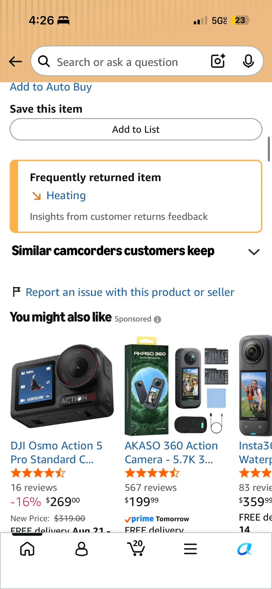
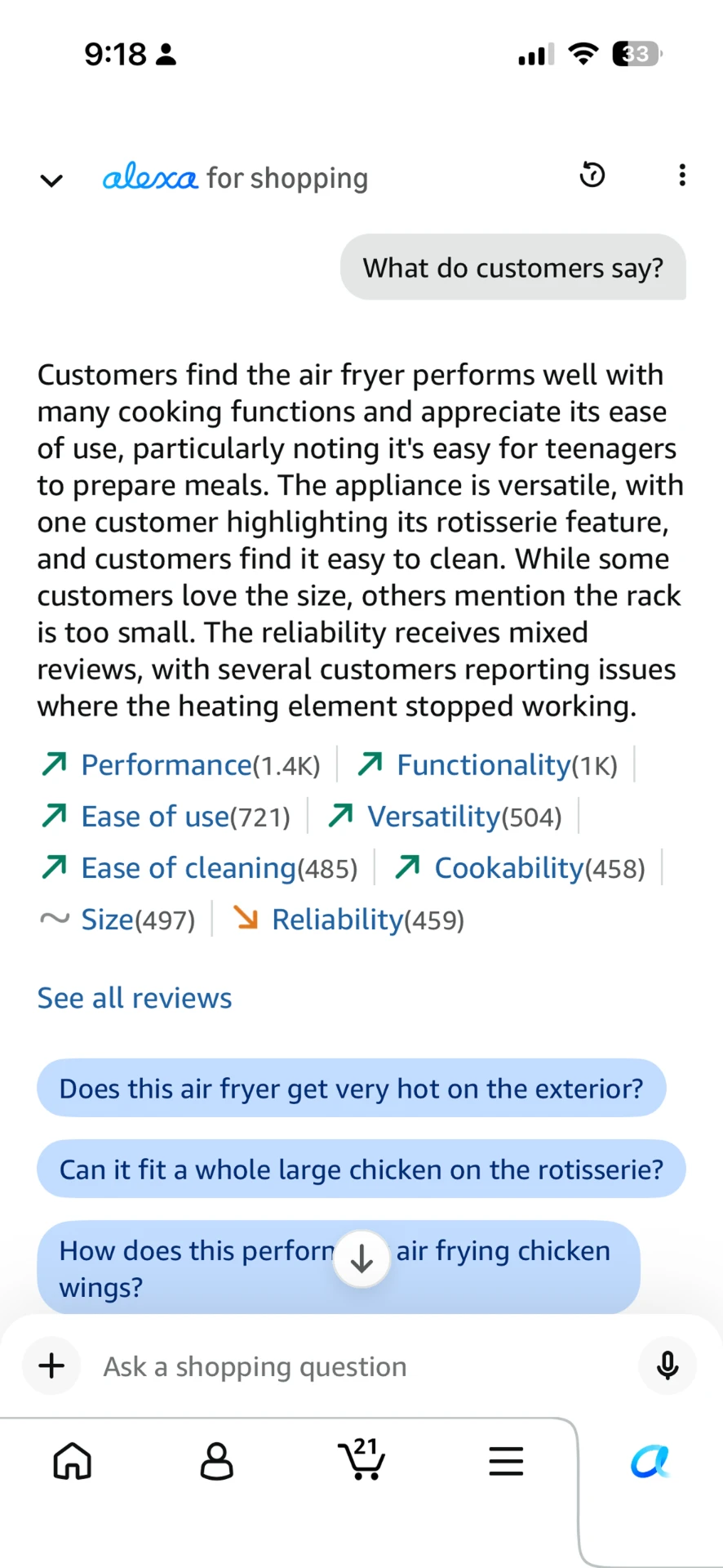
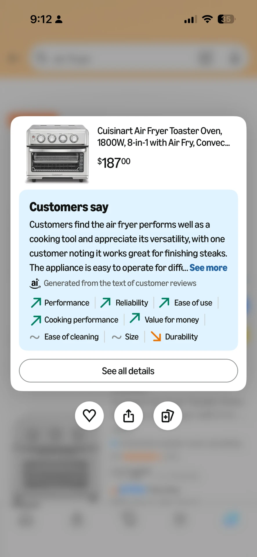
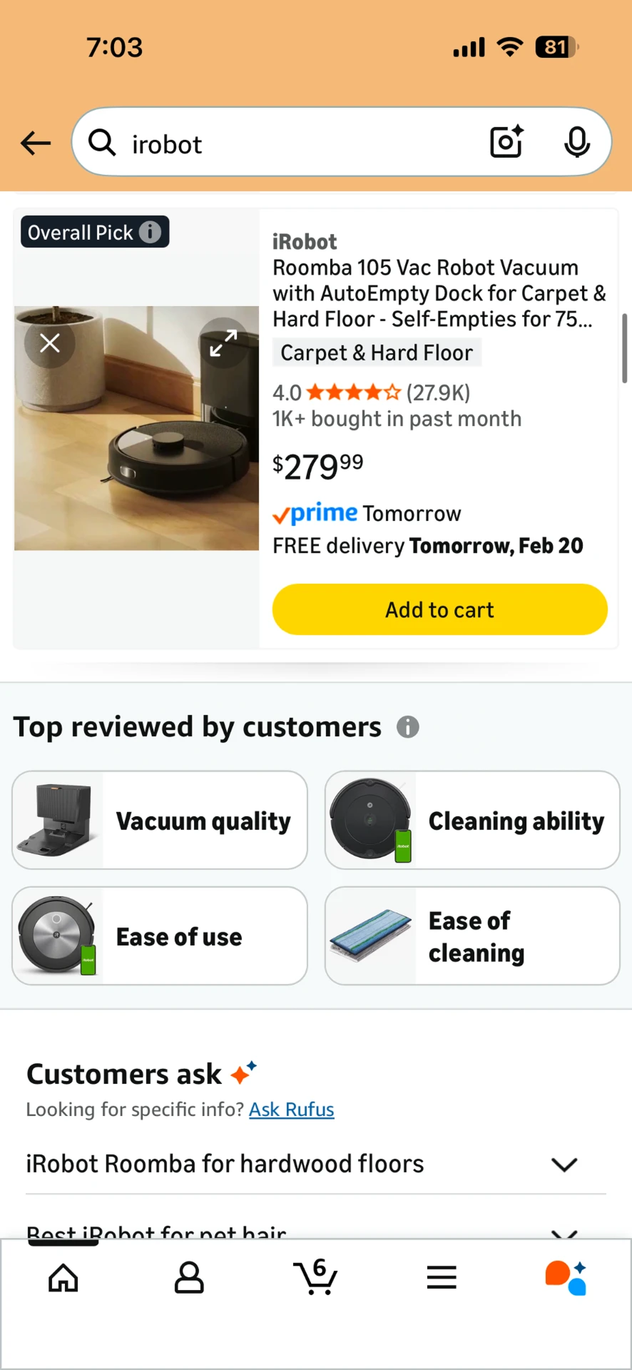
Progressive disclosure across the shopping journey
The research gave teams a framework for deciding how much review information to surface as customers moved closer to a purchase decision.
The right insight, at the right moment
What outlasted the sprint
What stayed with me was the method, not the final treatment. By isolating variables, we learned why a design worked, not simply which version won. That rigor helped us move quickly without moving blindly, and it still shapes how I approach AI experiences today: trust starts with understanding what drives an outcome.